Challenge Understanding
CubeSmart operates as one of the largest self-storage companies in the United States, with facilities across major cities like Los Angeles and San Antonio. This wasn't typical consumer app design: users make significant financial commitments, renting storage units for months or years to protect valuable possessions during major life transitions like moving or downsizing.
Cubesmart wanted an app that was a functional optimization for complex workflows involving location services, payment processing, physical access coordination, and ongoing account management. The self-storage industry presents unique UX challenges: unlike purely digital services, it requires seamless coordination between app functionality and physical locations, with users needing directions to specific entrances, access codes at precise moments, and support when standing at facilities.
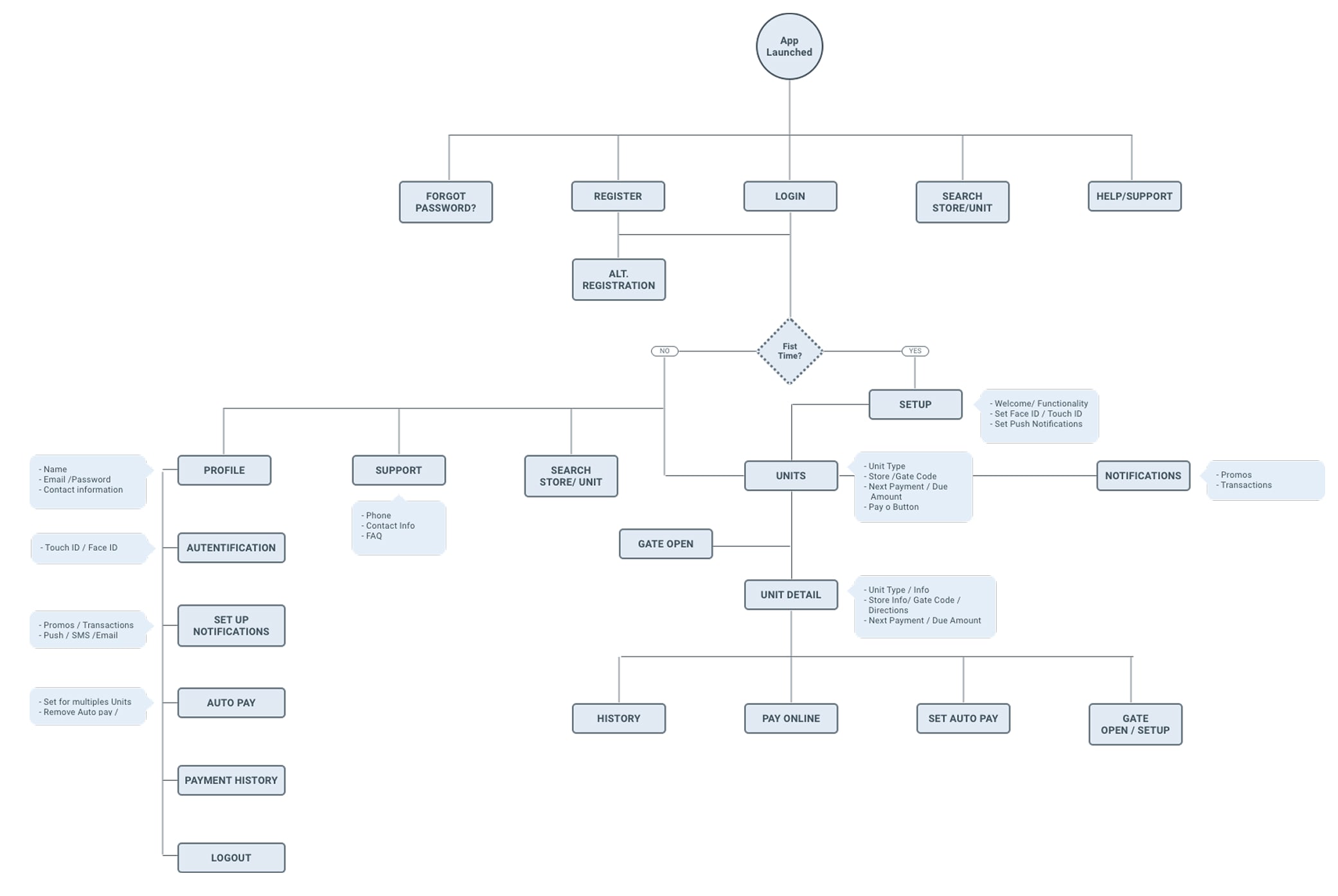
Diagram Flow
Representation of the user's journey through the application's key functionalities, from launch to unit management and payments. It displays the navigation structure and the application's organization.
“Complexity is the enemy of reliability. In systems where users commit financially and physically, UX must act as a layer of translation, converting operational complexity into user confidence.”
Design Approach
I focused on building trust and confidence at every interaction point, understanding that storage decisions aren't impulse purchases but carefully considered commitments. Working closely with CubeSmart's product team and business analysts, I designed the registration flow to build confidence gradually, introducing security procedures in context rather than as barriers.
My approach centered on intelligent search and filtering interfaces that help users understand their options without feeling overwhelmed by technical specifications. I collaborated directly with the development team to ensure seamless integration with CubeSmart's established design system, extending their visual language thoughtfully while solving specific self-storage workflow challenges.
The payment integration required special attention: these are recurring, significant expenses where users need rock-solid reliability and complete control over their financial commitments. I designed clear confirmation screens, easy payment method management, and transparent billing history that reinforced CubeSmart's professionalism.
Low - Mid Fidelity Wireframes
I started with low-fidelity wireframes to explore different layouts and navigation options.
My approach centered on intelligent search and filtering that helps users understand their options without feeling overwhelmed by technical specifications or pricing complexity. I collaborated directly with the development team to ensure seamless integration with CubeSmart's established design system, extending their visual language thoughtfully while solving specific self-storage workflow challenges.
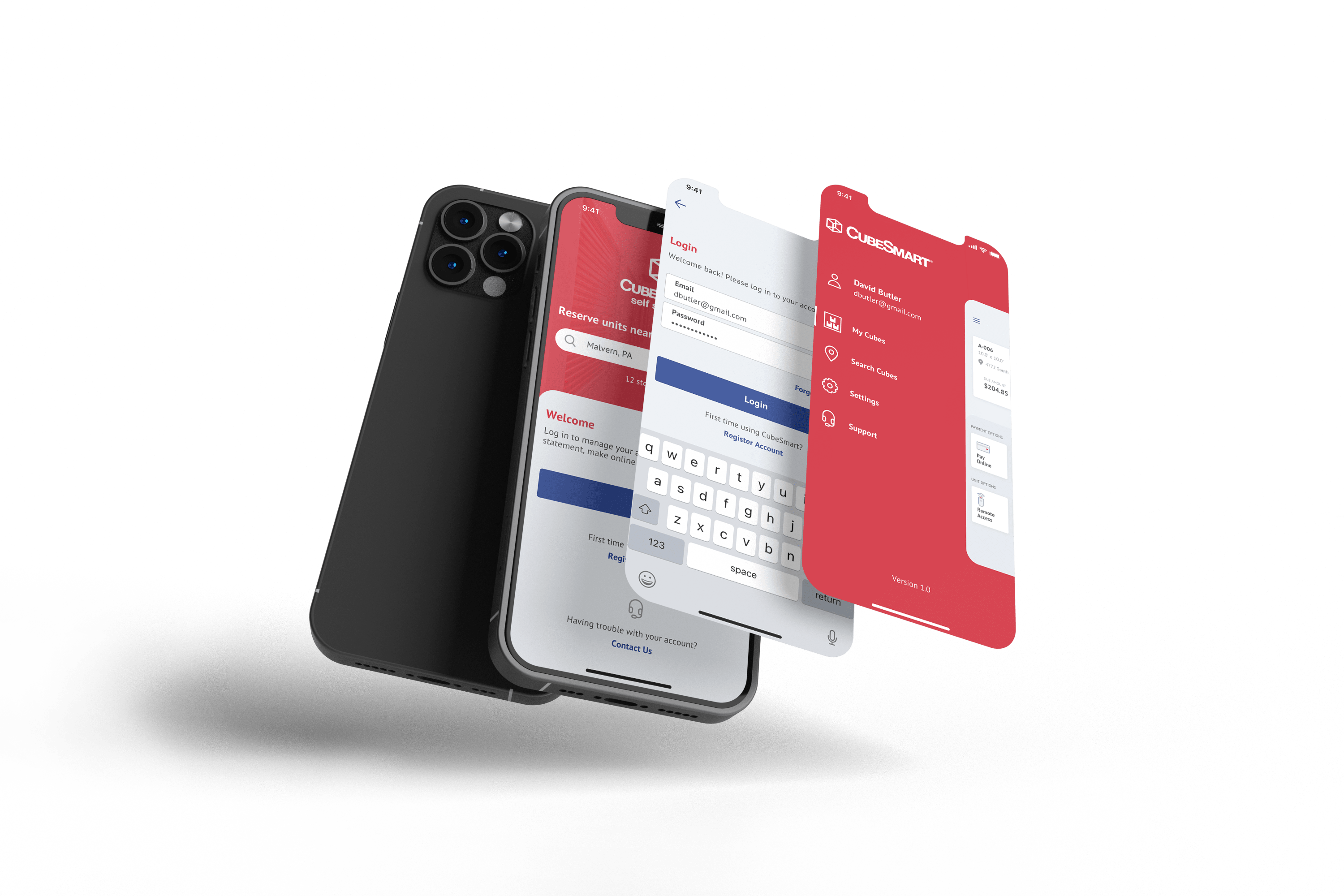
Visual Design
Implementation
The implementation focused on three critical areas: streamlined user acquisition, comprehensive account management, and location-centric features. I designed the registration and onboarding flow to eliminate information overwhelm, creating a progressive disclosure system that introduced security and access procedures contextually.
For account management, I created a centralized dashboard providing a clear overview of all active rentals, payment status, and upcoming actions, which is crucial since users often manage multiple units or handle family storage needs. The contextual notification system delivers timely reminders about payments and facility updates without overwhelming users.
Location features received special attention, with precise navigation integration that provides increasingly specific guidance as users approach their destinations: from facility location to building entrance to specific unit access. I designed real-time availability interfaces and facility information systems that surface relevant details exactly when and where users need them.
Results & Learnings
The redesigned CubeSmart app launched on both iOS and Android App Stores and is actively serving thousands of users across multiple US cities. I worked within CubeSmart's existing design system, not rebuilding from scratch but extending it: creating new components that fit their visual language while solving workflows the original app hadn't fully addressed.
The team structure was lean: a business analyst translating client requirements, me handling all UX and UI, and the development team taking the handoff from there. Working through a BA as the main client interface meant I had to make design decisions clearly defensible against business requirements, a discipline that sharpens the work.
The biggest design challenge was physical-digital integration: users don't just use this app at home. They use it standing at a facility entrance, sometimes in stressful situations. That constraint, designing for someone who's in a parking lot with boxes, shaped every flow.