Role
UI UX Designer
Timeline
2021
Tools
FigmaAdobe PhotoshopAdobe Illustrator
Skills
Wireframing & PrototypingUser Journey MappingLegacy System RedesignEnterprise DesignDashboard / Admin Panel DesignAccessibilityData Visualization
Redesigned the payment flow for a bilingual retirement banking platform serving senior citizens, rebuilt without the original design files and delivered in English and Spanish.
The Challenge
Join an ongoing retirement banking project where the original design files had been lost, requiring complete redesign of payment flows while creating age-appropriate interfaces for senior citizens managing their retirement accounts and pension information.
The Outcome
Successfully recovered and improved the lost payment functionality, enabling retirees to confidently manage their retirement accounts with simplified, accessible interfaces that meet banking security standards.
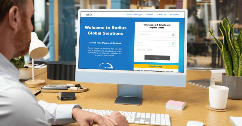
“Due to strict NDA policies, final UI visuals are omitted. However, this written case study outlines the complete design process and strategic impact. Detailed insights can be shared during a private conversation.”
Challenge Understanding
RADIUS is a retirement banking platform serving retirees who need to view their pension accounts, manage benefits, and process payments. The users are senior citizens, a very specific audience that needs interfaces with maximum clarity, familiar patterns, and zero tolerance for ambiguity in financial contexts.
When I joined, a previous designer had already done most of the platform work, but the original files were lost. My scope was the payment flow redesign: rebuilding and improving the payment processes in both English and Spanish, without the original design files as reference.
The bilingual requirement wasn't just translation. Financial terminology, confirmation patterns, and information hierarchy needed cultural adaptation for Spanish-speaking users, not just a word swap.
Design Approach
Working without the original files meant I had to reconstruct the payment logic through conversations with the PM and development team. The PM handled direct client communication. I worked from their requirements and the existing platform as context.
For senior users, every step in a payment flow has to communicate clearly what is happening and what comes next. Progress indicators, confirmation screens, and error messages carry more weight than in typical banking interfaces: these users are making decisions about retirement funds and need confidence at every step.
I designed both language versions in parallel, ensuring functional consistency while adapting the information hierarchy and confirmation language for each audience.
Implementation & Integration
The payment flows had to integrate with the existing platform components already built by the previous designer and the dev team. That meant matching patterns and visual language that I was reverse-engineering from the live platform rather than from design files.
The payment process covered multiple steps: account verification, payment method selection, amount confirmation, security validation, and receipt. Each step needed clear back-navigation, obvious error states, and confirmation language that would feel reassuring to a senior user managing real retirement funds.
Deliverables were handed off directly to the development team, with specs covering both English and Spanish versions.
Results & Learnings
The payment flow launched as part of the RADIUS platform, bilingual and integrated with the rest of the system.
The scope of this project was narrow (three months, focused on one critical flow), but the constraints were real: no original files, a specific and unfamiliar user audience, and a bilingual requirement that went beyond translation.
Designing financial interfaces for senior citizens shifted how I think about clarity. When the user is a retiree managing pension payments, "good UX" isn't about efficiency or elegance: it's about making someone feel safe enough to complete a transaction they might be nervous about. That's a different design priority than most projects.
Tags
#webdesign#B2C#UX/UI
Next Case Study