Role
UI UX Designer
Timeline
2019
Tools
- Figma
- InVision
- Adobe Photoshop
Skills
Wireframing & PrototypingUser Journey MappingBrand & Identity DesignDesign System Creation
Designed a multi-camera video synchronization system for the Mexican Football Federation — a tool for capturing and aligning footage from multiple stadium sources into a single timeline.
The Challenge
Create a desktop application that could manage multiple independent cameras, synchronize their recordings perfectly, and provide professional editing tools to revolutionize how Mexican football creates content and analyzes matches.
The Outcome
Developed and internally validated a fully functional system that demonstrated the potential to transform Mexican football's content creation and analysis capabilities, receiving positive feedback from professional clubs during testing phases.
User-Centered Design
Focused on intuitive interactions and accessibility.
Design System
Scalable components for consistency.
Challenge Understanding
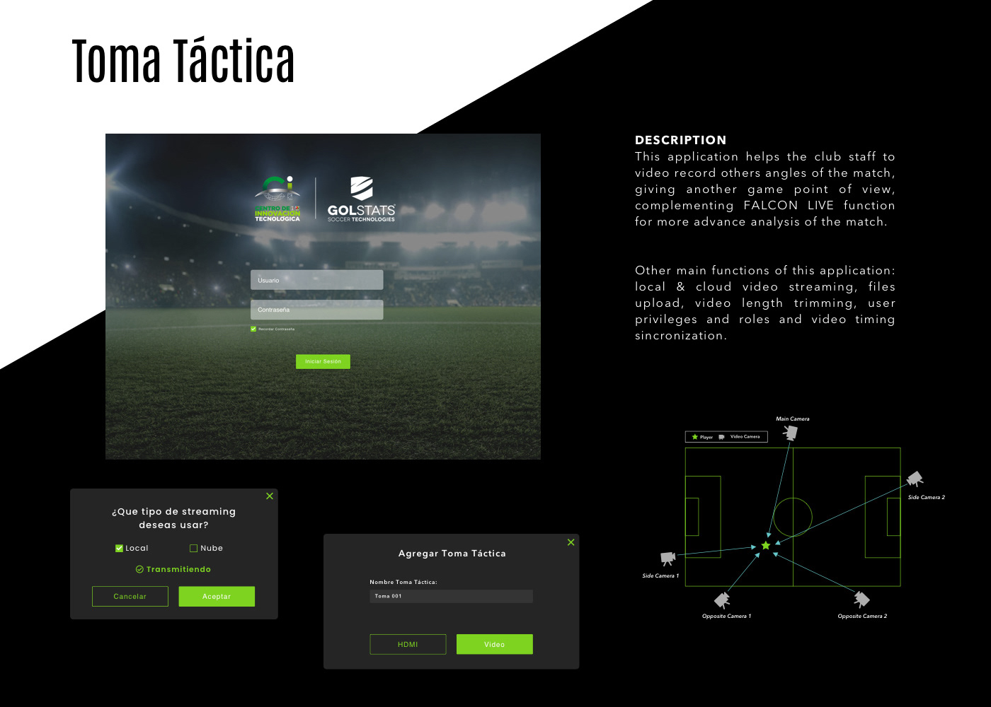
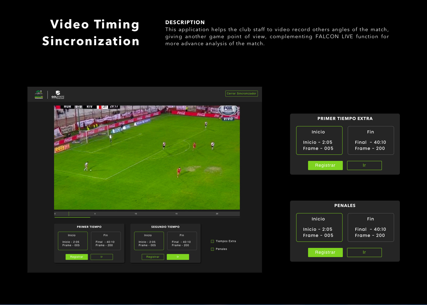
The Mexican Football Federation — through its Centro de Innovación de Tecnología — commissioned Golstats to design a system called Toma de Terceros: a tool that would let FMF staff capture match footage from their own cameras at different stadium positions, then synchronize all those sources into a single, aligned timeline.
The technical problem is non-trivial. Multiple cameras, different hardware, positioned at different angles, starting and stopping at different moments — getting all of those video sources to align frame-accurately requires precise timestamp synchronization. The FMF wanted to do this independently, without relying on traditional broadcast infrastructure.
The design challenge was making that underlying complexity invisible. The interface needed to be operable by stadium technical staff — not engineers — under live event conditions.
Design Approach
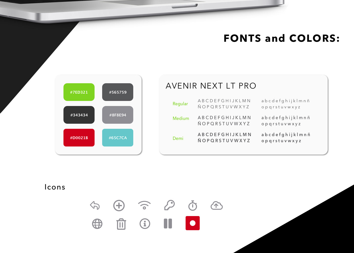
I designed the visual identity and interface from scratch: colors, iconography, UI components — all defined for this project. The system ran on Java/C# desktop, so the interface had to work on that environment without the flexibility of a modern web framework.
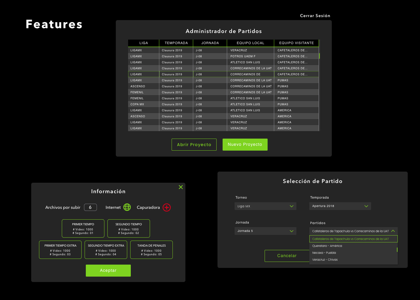
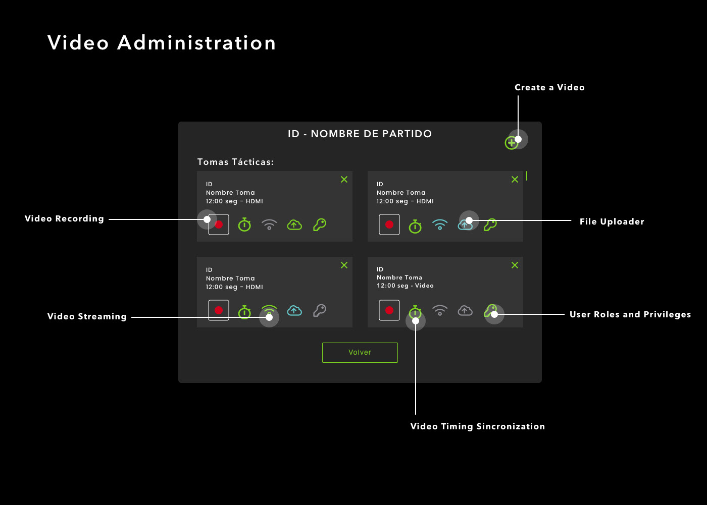
The core modules were: camera manager (connect and configure each camera source), match manager (create match sessions, set date, time, teams), time synchronization (align multiple video streams), and clip manager (handle partial recordings and segment them for review).
The design principle was deliberate simplicity — the functionality underneath was complex, but the operator should never feel that. Each step had one clear action. Status indicators showed camera connection and recording state at a glance. The timeline view made synchronization visual rather than technical.
Implementation & Integration
The project ran for three months covering design, development, and internal testing. The dev team built it in Java/C#; my deliverables were complete interface specs covering all modules and states.
After development, the system went through internal testing with professional clubs and their analytics teams. The validation confirmed the core concept worked — multiple camera sources could be synchronized and reviewed from a single interface.
The system supported both full-match recordings and partial clips, which was important for stadium setups where not all cameras run the full 90 minutes. Clip management let operators mark segments and align them against the main timeline.
Results & Learnings
The design was delivered and the system was built, tested, and validated with professional clubs. Administrative decisions at the federation level prevented public rollout — but the project met its technical and design objectives.
This was a short, focused project where the design work was less about visual complexity and more about information architecture: how do you present multi-source video synchronization in a way that doesn't require technical expertise to operate? Getting that right — making a complex system feel simple — was the core contribution.
Working on broadcast-adjacent tools taught me that the hardest design problems are often ones where the user should never see the complexity. The system had to handle frame-accurate synchronization across hardware sources with different specs — and the interface had to hide all of that behind simple controls. When technology is the core product, good UX makes the technology disappear.
Tags
#b2c#technology#ux/ui#webdesign
Next Case Study